
The project
A territory.
Its mark.
For Olio FVG we started from the name and identity of the Consortium, looking for an immediate, contemporary mark that would hold together the product and its land.
From the brand to its usage rules, from the animation to the website and the video: we built an essential communication path, recognisable in every application.
Objectives
- 01Link the product to the character of the territory
- 02Build an essential mark, recognisable across applications
- 03Take the Consortium’s identity from graphics to digital storytelling
What we did
- Naming and brand design
- Visual identity, variants and usage guide
- Logo animation
- Website design and development
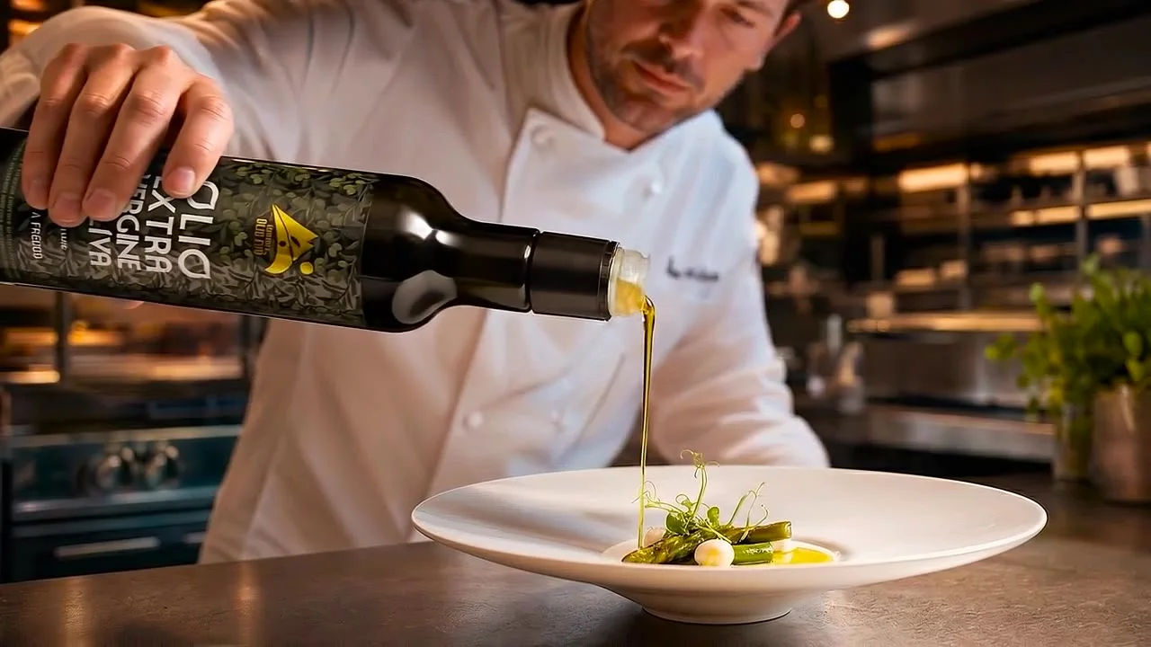
- Production of the film with the chef for the website opening
01 / Naming and visual identity
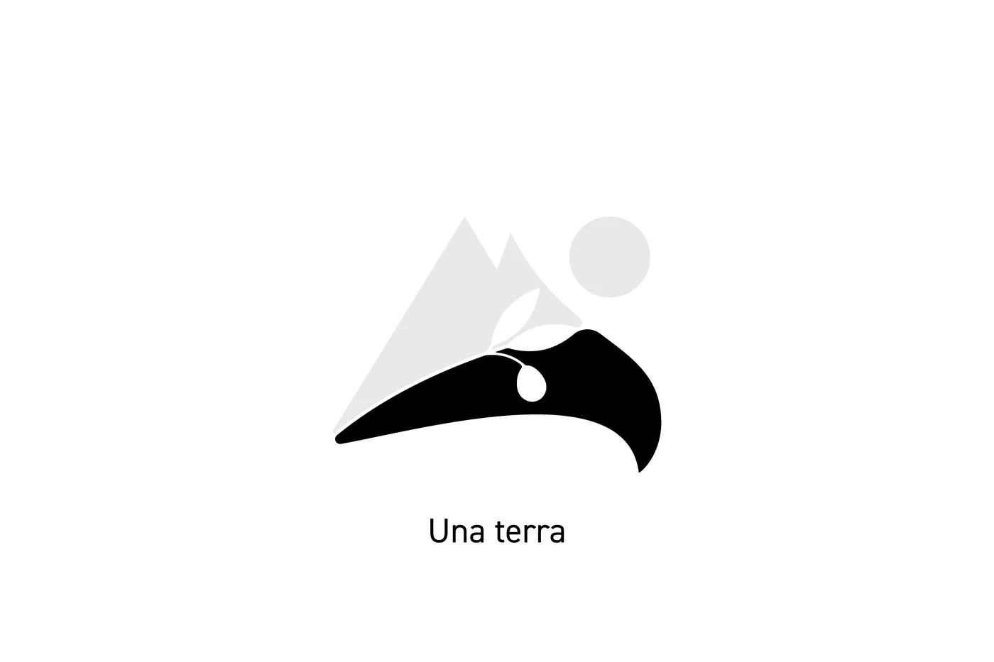
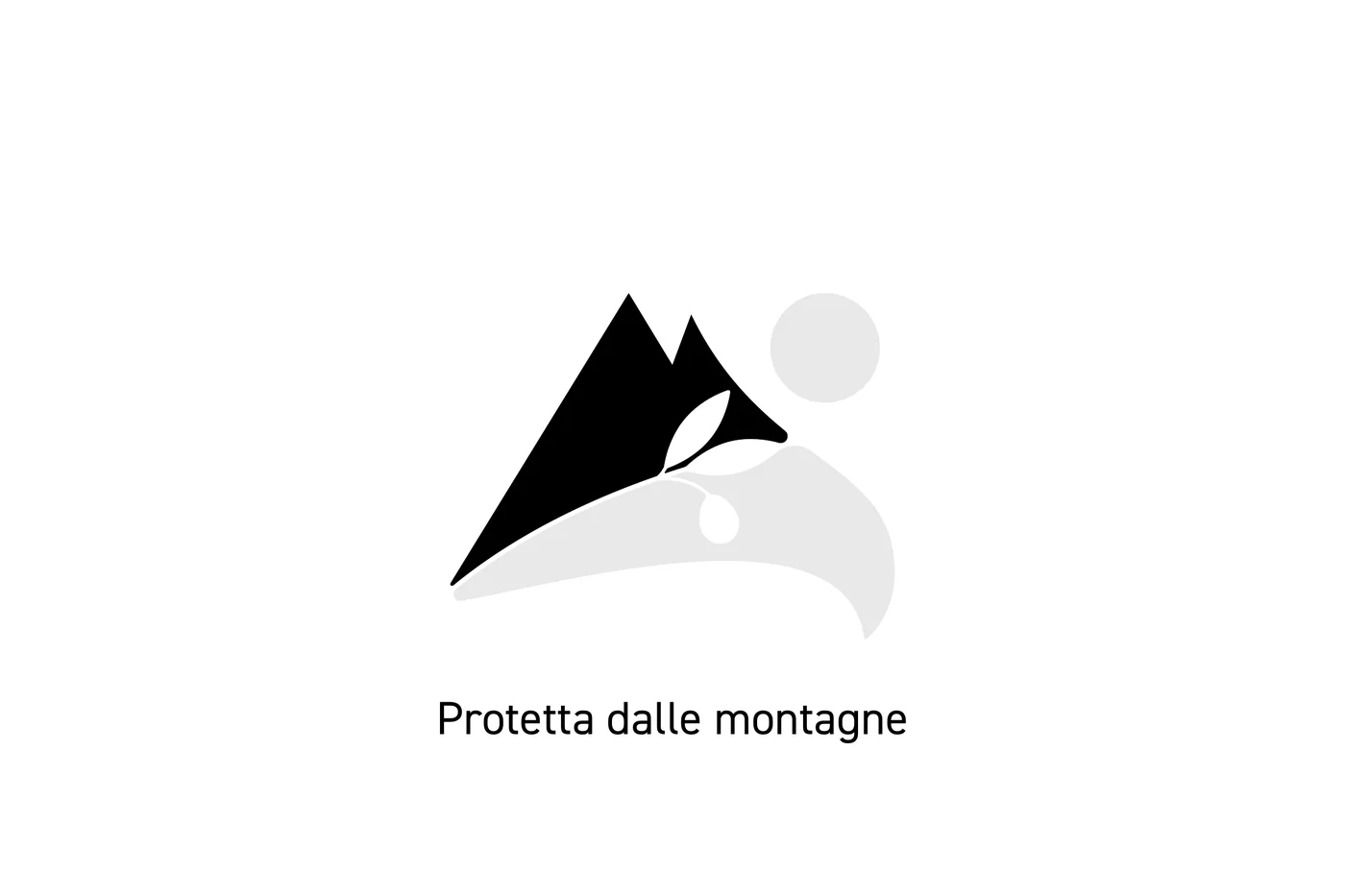
A land, sheltered by the mountains,
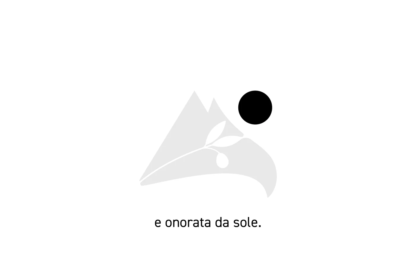
honoured by the sun.
The name Olio FVG put the territory at the heart of the brand. In the mark, mountains, an olive branch and the sun meet; the colours recall woods, crops and new oil. The usage guide set out variants and applications.
02 / Motion design
The mark builds itself
before your eyes.
The animation made the idea behind the brand visible: a few elements come into relation until they form the complete mark.
03 / Website and video
From identity
to experience.
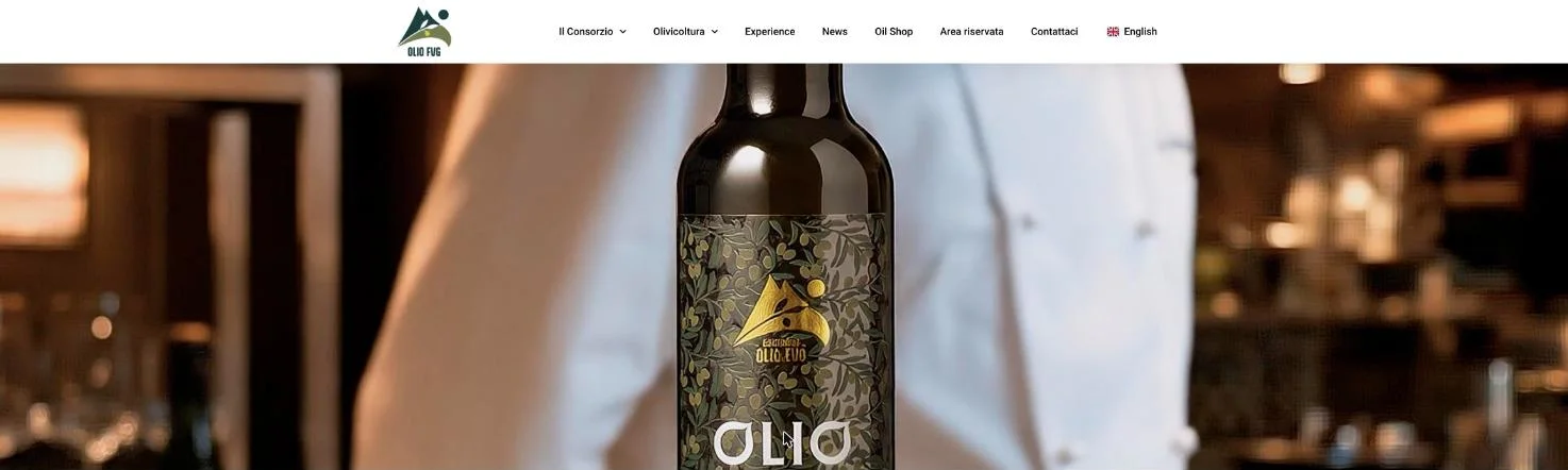
We designed and developed oliofvg.it, giving space to the Consortium, the olive mill and the territory. The film for the website opening put the product in the hands of a chef, through gestures and details.
Primastudio · The project